Wednesday, October 21, 2015


Study Period 5
Module 3
PART C

This assignment was about using an existing living area in my own home and turning it into a space that would be used in a Belle Magazine photo shoot. Quite challenging. 

This is my video blog of the work I did throughout this assignment.


Thursday, August 27, 2015

Thursday, August 20, 2015

SP5 - Module 2 - PC 8 Design Pesentation


These are my Moodboards for the design Presentation of 
1-2 Nelson St Dulwich Hill NSW
To Kent Constructions
 Student # E0504268

See Below for the Presentation Video


Audio Visual of Design Presentation
Progress Challenge 8


See Process Journal for reflective statement

Thursday, May 7, 2015

Progress Challenge 7 - Project

 REBRANDING PROJECT with Target and Akira


Akira Isogawa, fashion Designer is coming on board 
with Target Australia 
to create a collection that is affordable, yet 
"designer quality"


Akira Isogawa is such a talented designer but when interviewed about his work it becomes apparent how humble he is. He believes that his designs are the most important part of his label and not his own image. A strong contrast to the likes of Kim Kardashian or Victoria Beckham. He describes in his interveiw how you will almost always see him dressed in black so as not to take over from his designs. 

I decided in my rebranding project to respect this philosophy and not the try to re colour a logo but to connect the two existing logos and really try to bring Akira's ideals to the pop up area itself. 


Bringing the brands together 

 Targets logo can be reversed out of an Image or Red on a white background. It is also used as an object when promoting a particular line as seen above as the dummy. Always very clean simple lines.

 Targets branding is seen throughout the store as a simple target in the bottom right of the signage. The target logo is simple and effective it’s excellent branding and is instantly recognisable. Most commonly seen as Red it is also used within the store as black or reversed out of an image where the Target Logo is white. 

There are internal brandings within the Target range like “Your Sincerely” and Life “Style Australia”. The Target logo is not seen on the large format posters but can be seen on the smaller signage above the clothes themselves. Always clean lines when Target Branding is used. The back groung must be the same as the image background as per the Target Branding Guide lines.


 A simple yet personnel logo. 
Akira Isogawa hand written Logo is on the door of his Paris Private Rooms.
 
Akira Isogawa moved to Australia from Kyoto Japan in 1986 and fell in love with the freedom that Australia presented him with. He studied textiles at The Sydney Institute of Technology but after finishing he decided to go out on his own and developed the style he is famous for today coming full circle back to his Japanese routes. A lot of his textile designs come from inspiration he gets from Vintage Japanese textiles and Kimono’s.

In an interview with Akira he explains that his patterners and designs are the most impotant element to his work. He felt that nothing should dominate over that, therefore you will almost always see him wearing black himself. I feel that his logo follows that same philosophy. His simple hand written logo is quite often seen as white writing on a black backdrop at his fashion shows. Present and strong but never dominant. 


See Link below


RED
I have chosen to go with RED as the branding colour that connects the two clients. Akira Isogawa uses a lot of red in his textile designs and RED is synonymous with the Target logo. we will emphasis the RED this within the display on light box images, upholstery on the occasional chair and the rug on the floor graphic. Red is bold and youthful and is a symbol of energy, excitement, love, passion and strength. These are all things that Akira brings to his designs and will link the two brands together in a powerful way. Akira’s Logo will remain black or white to respect his ideals that his textile design is the most important element to his brand.
 

There are a number of brands that have
 successfully partnered with target 
3 of them are 

Dani Minogue
Missoni
Collette Diningan


 In these campaigns the Target logo stayed in it's simplest form, 
a red "Target" placed near the current logo of the designer.


 In previous campaigns target has adjusted it's logo to send a particular message.  


My first logo concept was to bring the Akira textile design into the Target logo rings. Targets branding is so strong with the target symbol that it is instantly recognised. The dominant red in the pattern links the design with the normal target branding colour, but having the other colours yellow and blue shows the versitility in colours within the Akira brand.


 My second logo concept was to connect the two brands but stay true to the current logo design. By adding the swing tag with the Target it keeps the image elegant and is a reflection of the designer image. The loop that connects the two together is one of Akira's textile designs. Bringing the bright colours of Akira into the logo.


The 1st colour concept for the Akira in store section is a light white industrial feel that is reminisant of Akira's showrooms. It has a real loft warehouse feel to it. The mannequins are life like the floors are Parbury - Salon Walnut touch in their look however the floor is covered in a floor graphic which includes an image of one of Akira's beautiful rugs. AS the floor will be flat with a non slip laminate there will be no trip hazard.

The 2nd colour concept has a much darker fell. The shelving will be black which will     make all the colours in the textiles POP. This is the dramatic look that Akira's produced when he has a run way show. A great way to bring the designer look into a Target store and the area will definitely stand out from the current displays in Target. The floor will be dark timber Premium Oak Black Forest, but will also be a floor graphic that has the Akira rug image printed on it. 

On this mood board I have tried to keep the images some what relaxed as this will be the first presiontation of the ideas, that we the client won't feel that there in no flexibility with the designs. 

Moodboard

I have put together a hands on moodboard that represents the 1st colour concept 
Warehouse Chic.


3D Modeling

The final touch to presenting a design to the client is to build a 3D image for the proposed space.

To bring this together I used Sketch up to build the 20m sq space. 
Including the modular units, freestanding hanging units, storage, displays and lighting requirements.


The idea for this display system came from a display I saw in  Freedom and Target stores.


To start this process I made some sketches to get the ideas flowing.


 From these initial drawings I developed the idea using "Sketch UP"
To keep the presentation relaxed so as not to lock the client into a fixed design concept, I used a sketch finish on my design.

Created by Mark Paschke.  Pencil Edges With Whiteout Border.  

This relaxed all the edges and allowed me to finish the details of the design in Photoshop. I added some detail but left unfinished areas again to give the impression of flexibility.


"Sketch Up"  3D  Images
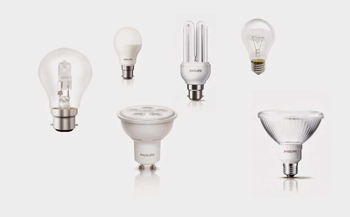


Lighting Plan


Down Lights in modular units. Light filters through glass shelves.

. Spot lights to enhance focus area’s and to give the feel of a catwalk in a fashion show.

. Light box in the back of the modular displays to bring the designer quality into Target Stores.
    Light the clothes in each modular section and the textile display screen behind the mannequins.


Final 3D Presentation


VISUAL AKIRA BRANDING ON THE STAND

 Akria Branding is seen her as 3D laser cut words placed in various position within the shop area. The akira sign hanging above will be seen from a distance accross the Target store. Akira can also be seen at eye level and on the plinth as people are walking past.


Friday, April 10, 2015

The future of colour

Is there a New Colour?
Why not.... there are so many thing we cannot understand in our universe already,
why not more colours than our eyes have been trained to see. 
Woman have more colour receptors in their eyes then men,
that's why when we talk to men about different shade of colours like teal or taupe,
  they look at us as if we are quite mad.

I see it every day at work when couples try to choose cushion colours
or lounge colours, couples therapy is in session I can promise you.....
 
There is news out there that a new colour has been discovered,
something we have never seen before.
It is not a colour mixed from the colour wheel.
This is almost to much for my mind to comprehend.
Like the concept that the universe goes on forever, 


but Why Not...


Below is the link to
The Scientist believe they found a new "shade" by firing packets of light through a cloud of super cold sodium atoms and then through a string of carbon nanotubes. 

Reference - http://www.independent.co.uk/news/science/scientists-discover-eighth-colour-of-the-rainbow-9227765.html

This article was posted on the 1st of April - April fool's day so it does make me wonder if it is in fact true. If it is, how fantastic and exciting this will be, if it's not I'm sure the scientist will keep looking. They believe that this sort of discovery may lead to effective cloaking technology.


Click here to see the article


Printing is always moving forward...

With in the colour spectrum that we know and love
there have also been new developments in printing.


3D printing to be precise.

 This technology is quite new but quite rapidly becoming available to more users. The school that my children go to have a 3D printer and at the moment they can only print in one colour but it won't be long till this new colour printing technology will be more commonly used.

Thursday, April 9, 2015

What are the Effects of Light.

How external elements can effect colour choice.

 Something important to consider is that colours can change under different external conditions.  For example I chose to paint the exterior of my house grey, for all intents and purposes this would seem quite straight forward. The only tricky thing would be to choose how light or dark I wanted the house to look. Not so!

When I started to look at the different greys available there is quite a range. 
With my first choice "Dulux Timeless Grey" although the colour chip was the right tone of grey, when I painted the sample colour onto my house it became quite green. This was because I live in a valley and as the sun hits the valley on the other side it reflects a green hue back. To balance this I had to choose a grey with a much warmer hue in it.
After many sample pots I came accross a house that had the exact colour I was looking for.  As I was talking some pictures of the house to try and work out what it was the owner of the house came out. I smiled and said hello and luckily she was very friendly. She told me they had used a Porters colour  "White Rhino."

Porters White Rhino                

This was the perfect colour for our house as it balanced the green reflecting from the valley. 
Another nice thing about this colour was that even on a sunny, blue sky day the house still looks grey and does not have a blue tint as can be the case with many greys. 
You can see bellow how a colour can chance in it's environment.


 Our house painted in Porter White Rhino.                       

Working with interior elements can have the same impact as about. Even the warm tones from a timber floor can have a profound impact on paint colours and the textiles within a room. It is really important to see samples in in the space so you can see what type of colour finish you will get. 


Choose your light source carefully!


Every space should have a lighting plan. From a home's interior to an industrial warehouse or a retail shopping environment, each place will have it's own specific requirements for lighting.


In a home situation you may need to use lighting for specific tasks. This image has a pendant light that will light the dinning table up when required. Because of the running costs of a house low energy compact florescent globes should be used here. In the past this would have ment that the lighting would have a cool look, however these days you can get "warm light" florescent globes which give a very nice soft warm light effect even LED light can give a warm feel.
They have also used down lights under the cabinets to light the benches and LED light again with a warm hue could be used here. You can also see lighting within the cabinets. This gives the room a feeling of generosity and all these different lighting effects soften the look of the room.


A large space like a furniture show room will need specific spot lights as the light requirements are so vast. It is very important that the furniture is illuminated correctly or the materials may have a unrealistic colour. When you are buying a large item like furniture it is always a good idea to take a sample home where it is to be used as all light source will alter the colour. Reflected light from wall colours, carpets, floorboards or even the green from the trees outside the room can change to look of a colour.


In smaller retain shops lighting will create a mood. The shop on top here looks contemporary, modern and quite clinical. They have used spot lighting as well as wall which give the clothes the correct amount of light. The lighting they have used is a very cool light. It CCT rating would be quite high, around 5000K. You can also see how light shinning on the reflective black surface can give the illusion of space, almost like a mirrored surface.

The shop bellow has a very different feel. Much more intimate, which is appropriate for a jewelry store. They have used down light and spot lights but they have a much lower CCT rating. It also make a big room seem a bit smaller and the specific task lighting in the cabinets help bring you eye and interest to them.


When there is little or no natural light coming into a space like a showroom, it is important to choose the correct style of light fitting and keep in mind the effects of colour that the globes can have.


Resources

http://www.toplightco.com/acatalog/stagelightingcollage.jpg
http://www.optiled.com/image/applications/app_retail_store_lighting_01.jpg
http://www.ledworld.com.au/wp-content/uploads/2014/09/ret2.jpg
http://www.new.omslighting.com/public/upload/images/luxury-shop-lighting-1.png

Colour Systems

The Spinning Brewster-Prang colour wheel


The use of the Spinning Brewster-Prang colour wheel when designing is invaluable. 
Using a system like the colour wheel, which you can buy online or at an art store, is used to mix colours and is an excellent system for working out colour harmonies.
It is also a great way to put together a colour scheme.

 You can purchase a colour wheel here HERE


When you use a colour wheel you can see how two colours will relate to each other. This works on the basic principals of the Primary, Secondary and Tertiary colours and their relationship to each other. It also shows the effects of tints tones and shades on a colour. By using the wheel you can create emphasis or create amazing visual effects with colours. An interior designer should have one of these wheels to help guild them on colour choices.


Click below to see


Pantone Colour System
 

 Another colour system is using Pantone colours. There are many different type of pantone books but they are used as a ways to standardize colours within a four colour print process. It is a book of solid process colour simulations. They are not cheap to buy but in the world of printing and graphic design you can't live without one.


You can purchase a Pantone book HERE


References

http://print21.com.au/new-plus-series-pantone-color-bridge-coated-solid-to-process-guide-code-gg4003/43318 
https://www.youtube.com/watch?v=DfKx7MjSEK0
http://www.stuff4crafts.com/creative-color-wheel-3389.html?currency=AUD&CAWELAID=120018150000170262&gclid=CKiK7qzq6sQCFVUsvQodI0kAVQ