Friday, April 10, 2015

The future of colour

Is there a New Colour?
Why not.... there are so many thing we cannot understand in our universe already,
why not more colours than our eyes have been trained to see. 
Woman have more colour receptors in their eyes then men,
that's why when we talk to men about different shade of colours like teal or taupe,
  they look at us as if we are quite mad.

I see it every day at work when couples try to choose cushion colours
or lounge colours, couples therapy is in session I can promise you.....
 
There is news out there that a new colour has been discovered,
something we have never seen before.
It is not a colour mixed from the colour wheel.
This is almost to much for my mind to comprehend.
Like the concept that the universe goes on forever, 


but Why Not...


Below is the link to
The Scientist believe they found a new "shade" by firing packets of light through a cloud of super cold sodium atoms and then through a string of carbon nanotubes. 

Reference - http://www.independent.co.uk/news/science/scientists-discover-eighth-colour-of-the-rainbow-9227765.html

This article was posted on the 1st of April - April fool's day so it does make me wonder if it is in fact true. If it is, how fantastic and exciting this will be, if it's not I'm sure the scientist will keep looking. They believe that this sort of discovery may lead to effective cloaking technology.


Click here to see the article


Printing is always moving forward...

With in the colour spectrum that we know and love
there have also been new developments in printing.


3D printing to be precise.

 This technology is quite new but quite rapidly becoming available to more users. The school that my children go to have a 3D printer and at the moment they can only print in one colour but it won't be long till this new colour printing technology will be more commonly used.

Thursday, April 9, 2015

What are the Effects of Light.

How external elements can effect colour choice.

 Something important to consider is that colours can change under different external conditions.  For example I chose to paint the exterior of my house grey, for all intents and purposes this would seem quite straight forward. The only tricky thing would be to choose how light or dark I wanted the house to look. Not so!

When I started to look at the different greys available there is quite a range. 
With my first choice "Dulux Timeless Grey" although the colour chip was the right tone of grey, when I painted the sample colour onto my house it became quite green. This was because I live in a valley and as the sun hits the valley on the other side it reflects a green hue back. To balance this I had to choose a grey with a much warmer hue in it.
After many sample pots I came accross a house that had the exact colour I was looking for.  As I was talking some pictures of the house to try and work out what it was the owner of the house came out. I smiled and said hello and luckily she was very friendly. She told me they had used a Porters colour  "White Rhino."

Porters White Rhino                

This was the perfect colour for our house as it balanced the green reflecting from the valley. 
Another nice thing about this colour was that even on a sunny, blue sky day the house still looks grey and does not have a blue tint as can be the case with many greys. 
You can see bellow how a colour can chance in it's environment.


 Our house painted in Porter White Rhino.                       

Working with interior elements can have the same impact as about. Even the warm tones from a timber floor can have a profound impact on paint colours and the textiles within a room. It is really important to see samples in in the space so you can see what type of colour finish you will get. 


Choose your light source carefully!
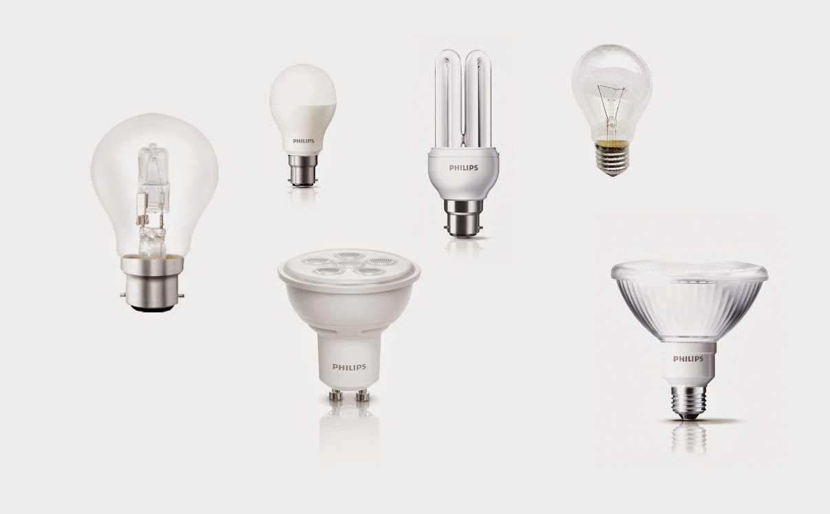

Every space should have a lighting plan. From a home's interior to an industrial warehouse or a retail shopping environment, each place will have it's own specific requirements for lighting.


In a home situation you may need to use lighting for specific tasks. This image has a pendant light that will light the dinning table up when required. Because of the running costs of a house low energy compact florescent globes should be used here. In the past this would have ment that the lighting would have a cool look, however these days you can get "warm light" florescent globes which give a very nice soft warm light effect even LED light can give a warm feel.
They have also used down lights under the cabinets to light the benches and LED light again with a warm hue could be used here. You can also see lighting within the cabinets. This gives the room a feeling of generosity and all these different lighting effects soften the look of the room.


A large space like a furniture show room will need specific spot lights as the light requirements are so vast. It is very important that the furniture is illuminated correctly or the materials may have a unrealistic colour. When you are buying a large item like furniture it is always a good idea to take a sample home where it is to be used as all light source will alter the colour. Reflected light from wall colours, carpets, floorboards or even the green from the trees outside the room can change to look of a colour.


In smaller retain shops lighting will create a mood. The shop on top here looks contemporary, modern and quite clinical. They have used spot lighting as well as wall which give the clothes the correct amount of light. The lighting they have used is a very cool light. It CCT rating would be quite high, around 5000K. You can also see how light shinning on the reflective black surface can give the illusion of space, almost like a mirrored surface.

The shop bellow has a very different feel. Much more intimate, which is appropriate for a jewelry store. They have used down light and spot lights but they have a much lower CCT rating. It also make a big room seem a bit smaller and the specific task lighting in the cabinets help bring you eye and interest to them.


When there is little or no natural light coming into a space like a showroom, it is important to choose the correct style of light fitting and keep in mind the effects of colour that the globes can have.


Resources

http://www.toplightco.com/acatalog/stagelightingcollage.jpg
http://www.optiled.com/image/applications/app_retail_store_lighting_01.jpg
http://www.ledworld.com.au/wp-content/uploads/2014/09/ret2.jpg
http://www.new.omslighting.com/public/upload/images/luxury-shop-lighting-1.png

Colour Systems

The Spinning Brewster-Prang colour wheel


The use of the Spinning Brewster-Prang colour wheel when designing is invaluable. 
Using a system like the colour wheel, which you can buy online or at an art store, is used to mix colours and is an excellent system for working out colour harmonies.
It is also a great way to put together a colour scheme.

 You can purchase a colour wheel here HERE


When you use a colour wheel you can see how two colours will relate to each other. This works on the basic principals of the Primary, Secondary and Tertiary colours and their relationship to each other. It also shows the effects of tints tones and shades on a colour. By using the wheel you can create emphasis or create amazing visual effects with colours. An interior designer should have one of these wheels to help guild them on colour choices.


Click below to see


Pantone Colour System
 

 Another colour system is using Pantone colours. There are many different type of pantone books but they are used as a ways to standardize colours within a four colour print process. It is a book of solid process colour simulations. They are not cheap to buy but in the world of printing and graphic design you can't live without one.


You can purchase a Pantone book HERE


References

http://print21.com.au/new-plus-series-pantone-color-bridge-coated-solid-to-process-guide-code-gg4003/43318 
https://www.youtube.com/watch?v=DfKx7MjSEK0
http://www.stuff4crafts.com/creative-color-wheel-3389.html?currency=AUD&CAWELAID=120018150000170262&gclid=CKiK7qzq6sQCFVUsvQodI0kAVQ

Thursday, April 2, 2015

Progress Challenge 6

History of Pop Art


 Advertising & Comics were a common feature of Pop Art


The arrival of “Pop Art” in the early 1950 was so new and impressive that it had a lasting cultural impact across society. The inspiration and meanings were so profound within this movement that they are still featured and produced in popular culture today.

Pop Art started out in England in the early 1950’s and by the late 1950’s early 60’s had found it’s way to America. It started as a rebellion against the Abstract Impressionist movement as this type of art was being  seen as overly intense and quite arrogant and had little or no
connection to peoples everyday lives.

The ideas in Pop Art reflect the realities of everyday life and the return of popular culture, thus the word “POP ART” is used to describe this period. During this time period art was a mix of advertising, television, comics, fashion, food and packaging and although the hype of Pop Art slowed down in the 1970’s it still remains very popular today.

It’s main identifying features are bold and solid colours, spots and strips to recreate the printed look from comics and advertising as well as the use of repetition. The use of iconic public figures and
intensely expressive portraits are often the subject of pop art, also the use of every day item such as packaging and simple objects are key features of this style.


http://www.posterclassics.com/Images-Drinks-French/bigVillemotOrangina%20(1).jpg

Bernard Villemot produced a lot of advertising
 in the Pop Art style during this time.