Tuesday, March 31, 2015

History of colour


Where did our first understanding of colour come from?


People have been fascinated by colour for more than 2000 years. 
Even cave men mixed colours to create their cave paintings. To this day we are still trying to understand, play with and manipulate colour. It is such as important aspect of our every day lives.


 Lascaux - Cave painting in France

The ancient Egyptians may have even used colour for cures and ailments. They understood that the sun brought them light and in their temples were jewels that refracted the suns rays to create different light effects. They understood the importance of blue, representative of the sky and green which represented their earth and this was seen in the colours within their temples. Their use of colour may have even been the start of the colour philosophy that we use today.

Maat and Isis - Ancient Egyptian artwork on Papyrus paper

 Another important anchient culture to to see the importance of colour are the Chinese. They have been using colour therapy for hundreds of years and it even dates back to the Ancient Egyptians.
The Chinese use colour to diagnose illness by reading the colour of the pulses, a persons complexion and the colours of the human tissues and organs.


 Sir Isac Newton & the Prism Experiment 

Sir Isaac Newton (1642-1726) created the foundation of the way we understand colour today. He published a series of experiments in 1672 in which he used a prism to refract white light to produce a rainbow of the component colours -red, orange, yellow, green, blue and violet. The blending of the colours as they merge, Newton described as hues.

Previous to this discovery it was believed that colour was created by mixing light and darkness.


Newton's color wheel combines colors with musical 
notes and planetary symbols


Mosses Harris and the colour wheel


Moses Harris (1730-1788) was an entomologist (a scientist who studies insects) and an engraver living in England. He wrote several books about the study of British insects in which he has hand coloured engravings. Moses was the creator of the first colour wheel in 1766 thus creating the foundation on which colour theory is built today.

The two colour wheels you see above are engraved and hand coloured plates. One is showing prismatic colours and the other is Compound colours.

Moses was mostly concerned with paint colour unlike Sir Isaac Newton who looked at the different effects on colour from light.

“The 18 colours of his wheel were derived from what he then called the three ‘primitive’ colours: red, yellow and blue. At the center of the wheel, Harris showed that black is formed by the superimposition of these colours.”


Muncell's Colour theory 


There were many different theories about how colour worked over the progressing years, but before Munsell the relationship between hue, value and chroma had still not been understood.
Musell's approach was based on rigorous scientific measurement of human vision.
He wanted to create a way to teach the "rational way to describe colour" He was a teacher at the 
Massachusetts Normal Art School, now Massachusetts College of Art and Design, or Mass Art.
In 1929 The Munsell Book of Colour was published. Even though there have been improvements in this theory over the years it is still very commonly used today to identify colours from things like the colour of beer to defining skin colour in forensic pathology.


References

http://robertlpeters.com/news/the-first-colour-wheel/
http://www.college-optometrists.org/en/college/museyeum/online_exhibitions/observatory/newton.cfm
http://www.colorsystem.com/?page_id=743&lang=en
https://m.facebook.com/Stillmanandbirn/photos/a.161530813901128.55524.160548623999347/443049725749234/?type=1
http://brightonmuseums.org.uk/discover/2013/07/04/rare-copy-of-moses-harriss-natural-system-of-colours-on-display-at-the-royal-pavilion/
https://www.pinterest.com/pin/415457134346949826/
http://www.arkangallery.com/AncientEgyptian/Maat-and-Isis#.VRt6oEbtJXs
http://www.smithsonianmag.com/ist/?next=/science-nature/cavemen-were-much-better-at-illustrating-animals-than-artists-today-153292919/
http://thepowerofcolor.com/color-in-action/colorful-beginnings/
http://en.wikipedia.org/wiki/Munsell_color_system

Sunday, March 29, 2015

How colour effects us.

Colour can make us feel 
a range of different emotions.

The following are some examples how colour can be perceived or even make us feel. Colour is the most powerful non-verbal way of conveying a message. Merchandisers and advertising agencies have used these colour techniques for a long time to manipulate the consumers perspective. If colour is used cleverly in an interior design space it can also evoke certain feelings and moods. You can see bellow just how intricate the effects of colour can be on ones subconscious.


Red - Red is a colour of power, it is a colour that comes at you rather than away from you. That is why it is a good colour to use as a stop signal. Red is stimulating and makes you feel alive, it can even elevate your heart rate.


Action, Adventure, Aggressive, Blood, Danger, Drive, Energy, Excitement, 
Love, Passion, Strength and Vigor


Blue -Blue is the colour of intelligence, it is soothing and puts the mind at ease. Quite often people will choose blue as their favorite colour. It will help create a feeling of calm but can also be perceived as cold if used in the wrong way.


Authority, Calm, Confidence, Dignity, Established, Loyalty, Power, Success, Secure and Trustworthy


Yellow - Yellow is a colour used to show optimism and confidence. It is a very happy colour. This is a colour that stimulates our emotions. If used incorrectly it can have the opposite effect and cause very negative emotions.


Caution, Cheerful, Cowardice, Curiosity, Happiness, Joy, Playful, Positivity, Sunshine and Warmth


Green - Green brings balance to our lives. Green is in nature all around us and required no adjustment for the eyes therefore it has a feeling of harmony and reassurance. Most people feel at rest with the colour green but it can also evoke a feeling of blandness.


Crisp, Environmental, Fresh, Harmony, Health, Healing, Inexperience, Money, Nature, Renewal and Tranquility


Violet - Violet can mean spirituality, comfort, passion and security. It is quite often connected to royalty. It can make us feel introverted and evoke deep contemplation. Too much violet can become depressive.


Ceremony, Expensive, Fantasy, Justice, Mystery, Nobility, Regal, Royalty, Sophistication and Spirituality


Orange - Orange is the colour of abundance. It also has a stimulating and emotional effect on people. It make us contemplate food, warmth and shelter. In opposition orange can give the impression of a lack of seriousness.


Affordable, Creativity, Enthusiasm, Fun, Jovial, Lighthearted, High-Spirited and Youthful


Pink - Pink gives a feeling of tranquility and love. Even though it is a tint of red it soothes rather than stimulates. Pink is considered a feminine colour and therefore can sometimes be emasculating.


 Appreciation, Delicate, Femininity, Floral, Gentle, Girly, Gratitude, Innocence, Romantic, Soft and Tranquil


Grey - Grey is a neutral tone and as such can lack in emotional stimulation. It is therefore quite often considered depressing or cool. There is a lot of grey in interiors today and quite often it is paired with wooden finishes. This will then brings some warmth back into the space.


Authority, Corporate Mentality, Dullness, Humility, Moody, Practicality, Respect and Somberness


Black - Black absorbs all light. It is linked to sophistication and glamor. Black projects a feeling of weight and seriousness.


Authority, Bold, Classic, Conservative, Distinctive, Formality, Mystery, Secrecy, Serious and Tradition


White - White is the total reflection of the colour spectrum. It is clean and simple and uncompromising. White can give a heighten perception of space but can also make a space feel clinical.


Cleanliness, Innocence, Peace, Purity, Refined, Sterile, Simplicity, Surrender and Truthfulness


Brown -Brown is the colour of earth and nature and is considered a reliable and supportive colour. However it can convey a feeling of heaviness and lack of sophistication as well.


Calmness, Depth, Earth, Natural, Roughness, Richness, Simplicity, Serious, Subtle, Utility and Woodsy.


This is just a small indication of the depth of feelings that these colours can convey. Such a fascinating topic.

FOR MORE INFORMATION FROM MY REFERENCE,
 SEE THE LINK BELOW

LINK - Psychological Properties Of Colours


Image Refferences

http://www.graphicmania.net/how-to-pick-the-right-color-for-your-brand/
http://www.pricedigital.com/images/Blog/logos-colors/logos-blue.jpg
https://laurengastonx.files.wordpress.com/2012/04/arch-logo.png
http://www.1stwebdesigner.com/wp-content/uploads/2010/08/32-great-green-logos.jpg
http://thestockingslady.blogspot.com.au/2013/05/living-room-orange-ideas.html
http://www.polyvore.com/pink_furniture_sofa_blyhte_momoko/thing?id=62396068
http://creepypasta.wikia.com/wiki/File:Jac_126-1220_old_grey_house.jpg
http://www.logocritiques.com/resources/color_psychology_in_logo_design
http://www.terrysfabrics.co.uk/blog/2014/08/29/doing-the-white-thing-12-ways/
http://www.logocritiques.com/resources/color_psychology_in_logo_design

Progress Challenge 5


Experimenting with Light Sources 
 
Luminous efficacy. 
How well different light source produces light.

We had to choose different light sources ( globe types) to see how these can effect an object, lighting and colour when taking photographs as well as the flow on effect of these lighting choices in a lighting plan.


 These are the globes I chose to use.


I set up a small studio area so that all the conditions could remain the same for each photo. That way I could see the difference each globe was really making. My control photo started with just natural light and the camera on a tripod. All the camera settings stayed the same.


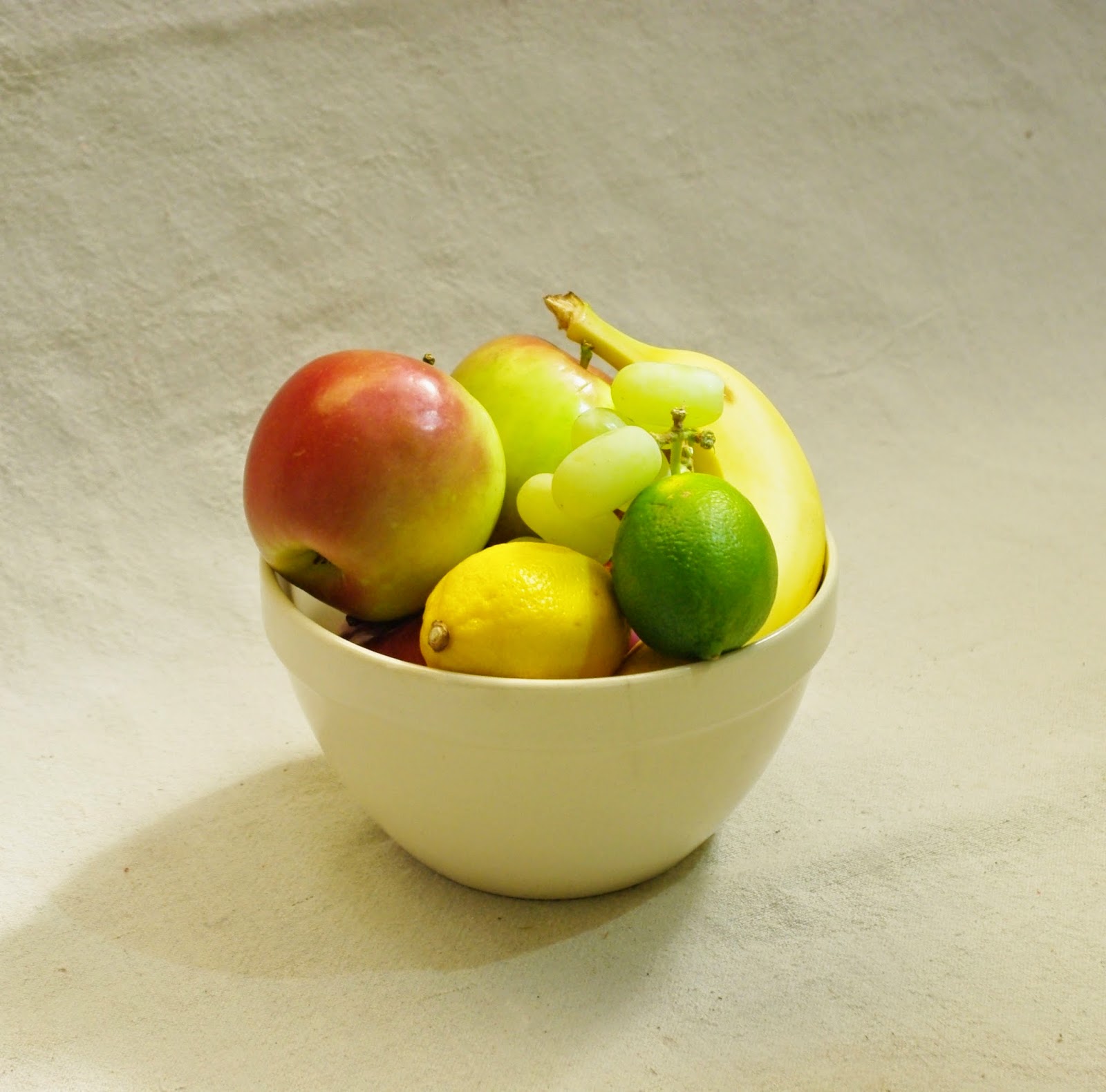
My first object was a bowl of fruit. Most of the fruit has a matt surface. I could see how a matt surface would react to the introduced light sources. Also there was a good variation of colour. The 1st photo I took was just of natural light then I would have a control photo to use as a reference. This also then combined natural light with the an introduced light source. You can see the results bellow.


Natural Light
Object 1 - matt surfaces


Natural day light has a 
CCT of 6000K a cool hue.

My studio was set up in a outdoor space underneath a yellowish laser light roof. This counterbalanced the cool hue of the daylight and that is why the picture appears neutral in hue.

I used Natural light as my control. The camera was set up on a tripod and the camera setting all stayed the same. The different light sources were all from the same place on the right hand side.


Incandescent globe

Object 1


An incandescent globe has a CCT of 2800 K

This produced a warmer colour hue to the finished photo than the natural light photo. The object is lit by natural light and by placing the light source on the right hand side you can see this creates a shadow on the left hand side.


Compact fluorescent lights 50-75
Object 1


A compact fluorescent globe has a CCT of 4000 K

This produced a more natural hue to the finished photo. The object is lit by natural light. By placing the light source on the right hand side you can see the shadow on the left but on flare on the fruit except the apple.


Light-emitting diodes 15-30 LED
Object 1


A compact flurescent globe has a CCT of 3000 K

The LED light source fell mostly on the objects therefore the background was less effected by the LED light, and there is some flare on the fruit as LED globe have such strong directional ability. The light source was on the right hand side but as the objects, apart from the apple are matt, there are only small flares produced by the addition of the light source.


Halogen lamps 10-25
Object 1


A Halogen globe has a CCT of 2800 K

This produced a very warm colour hue to the finished photo. This globe was in a bed side light. I feel the K rating of the globe must be much lower, around 1500K as the photo is so much warmer. There is no flare on the fruit in this image ( except the apple that is shinier) 


-----------------------------------------------------


My second objects were a bit more eclectic. I chose them to see the difference a shiny surface would make in the lighting test. They also had a good variation in colour and texture. The 1st photo I took was just of natural light again, then I would have a control photo to use as a reference. This also then combined natural light with an the introduced light source. You can see the results bellow.


Natural Light
Object 2 - Shinny surfaces


 Natural day light has a 
CCT of 6000K a cool hue.
My studio was set up in a outdoor space underneath a yellowish laser light roof. This counterbalanced the cool hue of the daylight and that is why the picture appears neutral in hue.

I used Natural light as my control. The camera was set up on a tripod and the camera setting all stayed the same. The different light sources were all from the same place on the right hand side.


Incandescent globe
Object 2


An incandescent globe has a CCT of 2800 K

This produced a warmer colour hue to the finished photo. The object is lit by natural light and by placing the light source on the right hand side you can see this produced light reflections on the shinier objects.


Compact fluorescent lights 50-75
Object 2


A compact flurescent globe has a CCT of 4000 K

This produced a more natural hue to the finished photo. The object is lit by natural light. By placing the light source on the right hand side you can see this produced light reflections on the shinier objects.


Light-emitting diodes 15-30 LED
Object 2


A compact flurescent globe has a CCT of 3000 K

This produced a quite similar to an incandescent globe.  However the beam of light was much more directional and fell mostly on the objects therefore the background was less effected by the LED light. The object is lit by natural light. By placing the light source on the right hand side you can see this produced light reflections on the shinier objects.


Halogen lamps 10-25
Object 2


A Halogen globe has a CCT of 2800 K

This produced a very warm colour hue to the finished photo. The object is lit by natural light and by placing the light source on the right hand side you can see this produced light reflections on the shinier objects. This globe was in a bed side light. I feel the K rating of the globe must be much lower, around 1500K as the photo is so much warmer. 


Lighting can play such an important part of how a space will feel, something I think few retailers get right in their change rooms. It can mean the difference between me buying the item of clothing or putting it back on the shelf. Imagine how much more $$$ they could make if they could get that one thing right.

CCT Value of different globes

Resource
http://www.popularmechanics.com/technology/gadgets/reviews/g164/incandescent-vs-compact-fluorescent-vs-led-ultimate-light-bulb-test/


Sunday, March 22, 2015

Progress Challenge 4

Colour Matching

1. The first colour matching swatch is from a photograph I have of my daughter and I chose to match her dress. I used White, Crimson, Lemon Yellow and the smallest touch of Prussian blue to mix this colour.

2. The second colour match swatch is from the material of a dress. I chose the teal colour within the pattern. To make this colour I had to increase the value of the hue by adding white. The colours that make up this swatch are Prussian Blue, Lemon Yellow added to a reasonable amount of white. 

3. The Thirds swatch is a piece of timber floor board. There are a few different hues within this sample piece. So when for a colour that would work with this sample across the board. The colours I used to mix this swatch are Yellow Ochre, Lemon Yellow, Crimson  and a very small amount of Prussian Blue to tone some of the yellow down. I needed to add a fair amount of white to achieve the right value.


This is the pallet I used to work through the colour matching process.


Colour Mixing


There are two different platforms for mixing colours. 

RGB is for screen viewing only - Additive mixing is when there is a black base behind the colours like the black screen on the computer or the TV. These colours come from the light.
RGB ( Red, green, blue) is an additive colour mode.

CMYK is for Digital printing - CMYK (Cyan, magenta, yellow, black) is a subtractive colour mode as the paper background used in printing is white. It is made up of lighter secondary colours. To make a darker colour you just have to add more ink to the printing.


When producing imaging for your client you must be aware that what the client sees on the screen of the computer will be different to the finished printed material. In the advertising industry a digital artist will make two separate files. One to go to the printer and one for presentation using pantone charts to choose a similar colours. This is the best way to represent the closest colour to be used in the final print.

Progress Challenge 3

Creating a colour wheel using the provided template.

There were a few different visual concepts that I could have used to create my colour wheel, but as I have such a strong background in photography I couldn't go past the temptation to use different photos of textures to represent my colour wheel. I love the finish that it has given to my colour wheel and that it represents so many different parts of our environment. 

 My Colour Wheel


Brewster-Prang's colour wheel was created in 1876. It is the most common colour wheel used today.
Sir Isaac Newton created the original colour wheel in 1666. His first colour wheel was more of a pie chart which came about as he focused on the nature of light when using a prism. He could see how the natural sequence of colour was formed. He joined these wedges of colour together in a circle to produce the colour wheel.


Thursday, March 19, 2015

Progress Challenge 2


Using paint to create a graduation from a pure hue 
to a de-saturated grey 
from 2 complementary colours


For my 1st attempt I used yellow and violet. This was not very successful and I was not all that happy with the result, this was a lot harder than I thought it was going to be.......


For my next attempt I chose  Prussian Blue and Ochre Yellow
(Orange) I am much happier with the results and you can see that I managed to make a successful grey from these two colours.


 Graduation Chart 
Mixing two complimentary colours 
to make a de-saturated grey.


COLOUR THEORY - Colour basics


THE COLOUR WHEEL

Colours can be organised into a number of different systems. 
One of the most common is the Brewster/Prang colour wheel. 
This is one of the simplest ways to explain colour relationships.

The colour wheel is made up of layers of colour

PRIMARY COLOURS
Red - Yellow - Blue

SECONDARY COLOURS
Orange - Green - Violet

TERTIARY COLOURS
Yellow-Orange - Red-Orange - Red-Purple -Blue-Purple - Blue-Green - Yellow-Green


SPECTRUM OF VISIBLE LIGHT

Colour is a property of light. Without light there can be no colour. 

Opaque surfaces absorb different wavelengths of light. 
Violet has the shortest wavelength and red has the longest. 


White light contains the entire spectrum of colours. When white light hits an opaque surface some colours are absorbed and some are reflected. It is the colour that is reflected from the surface that we can see, this then becomes the hue of that object.

For example during the life cycle of a leaf the hue that is reflected will start of as green. All the other colours in the spectrum are absorbed and green is the colour that is reflected making the leaf appear green. During the life of the leaf its structure changes as it dries out through the autumn months. The leaf is now absorbing different wavelengths and therefore will appear red, orange or even yellow. The leaf now absorbs the green and will reflect different hues.


Nature is so amazing. We quite often take colour for granted but learning about this process is fascinating. Just looking around my desk I feel like I am seeing the magic of all these colours for the first time.


THE THREE DIMENSIONS OF COLOUR

HUE
This is the name we attribute to a colour. A way in which we can explain and discuss it’s value. “ That red dress really suits you.”

VALUE
When identifying a colour that is not pure we can look for the degree of lightness or darkness by relating it to Black and white. For example Pastel colours have a lighter value.

SATURATION
A colour can either appear bright or dull. If white is add the colour appears brighter. If more black is added it will have a dulling effect.

All three attributes are connected. If you alter one the other two will simultaneously alter as well.


Munsell's Colour System

Muncell's system has five principal hues and five intermediate hues. They are arranged horizontally in a circle.

The neutral grey values extends vertically through the center of the circle in ten equal steps from Black to white.
The chroma or intensity radiates out from the vertical scale of values. The number of steps will changes depending on the attainable saturation of each colour's hue and value.

Ref: Francis D.K. Ching Interior Design Illustrated